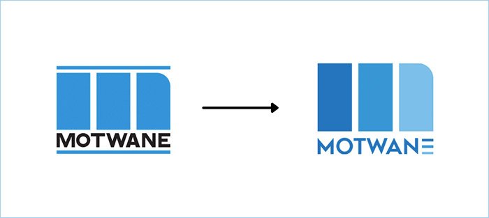
Decades of learning, experience, and the commitment to innovation has made Motwane a go-to name in the Indian Test & Measurement industry. With its substantial and continuous investment into R&D, as well as the firm’s dynamic and ‘ideas-first’-culture, Motwane’s high-performance product range was developed, launched, and received with great success. While the business significantly evolved over the years, Motwane’s look & feel, however, remained the same. In 2020, the leadership decided to tackle the need for updated visual identity that reflects Motwane’s legacy of the past, and its promise of the future. “Motwane’s old logo was a powerful design, and created high visual recall within our industry” explains Jitendra Agrawal, the firm’s Managing Director. “Last year, we felt that the time had come to modernize not only our products and services but also our overall look so we can grow into new markets from a place of strength and clarity about who we are and what we have to offer.”
The change in brand identity is a significant milestone for Motwane.
Motwane chose to tell its new story without compromising on its legacy and deep-rooted values: To be collaborative, curious, and authentic. While the new international look and feel gives it the brand a clear visual distinction from its competitors, it also takes the strong values Motwane has been built on into the future and across the world.
Logo Development over the years
- Origin: The original MOTWANE logo was conceptualised and designed in 1960 by SISTA Advertising, a legendary firm at the peak of its time. Motwane was an integral part of India’s industrialisation by providing plants for cement, fertiliser, petrochemical, polyester, locomotives, grain silos, audio systems and instrumentation. The three lines in the logo represent India, its industry, and Motwane as an active part in it.
- Color Change: In 1980, the original brown color was changed to blue to give the logo a facelift with a fresh new color scheme.
- New look & feel: The refreshed logo maintained the concept of the ‘three lines’ as representation of being bold, reliable and trustworthy. It has been further enhanced with a cleaner font, brighter and lighter colors, and three horizontal lines in the ‘E’. These lines symbolize the idea of a digital twin, merging the worlds of physical products with their identical online version.
We invite you to embrace the future with us!
Having earned the trust of clients over the last 100 years with innovative, energy-efficient, and user-friendly solutions, Motwane continues to forge full-steam ahead on their journey as industry pathbreakers. Having announced the launch of several new products built around an improved customer experience through innovative IoT and software integration, MOT-WARE is the newest addition to their portfolio. With it, Motwane will lead their customers into a digitized future. Gautam Khandelwal, Chairman of Motwane Group, is exited to turn Motwane’s vision into a concrete reality: “As a team, we will do our best to create an Indian champion in the Test & Measurement space that can compete with the best globally.”
Find out more about Motwane on its new website www.motwane.com! ☺


